+2
Completed
Alphabetic order in Scroll list "Pop up" selector list
Paulo de Almeida 9 years ago
in Applications / Studio (Server editor)
•
updated by Aleksandr Romanov (CTO) 8 years ago •
6
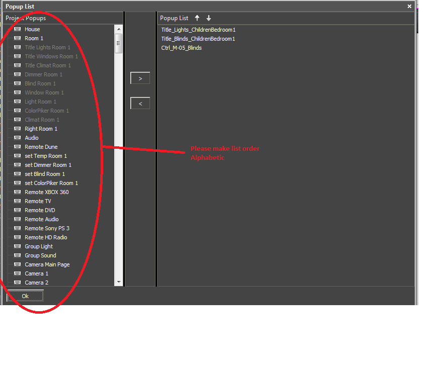
The order in the selection list should and has to be Alphabetic.
This is very important. If you have a big project is quite difficult and time consuming to scroll trough all the "pop up´s" every time to find them. Also after choosing a "pop up" and press the > button, the cursor jumps to the beginning of the list on the left. So you have to again scroll and scroll and scroll.... to add the next pop-up.
!!!
This is part of Iridium Work flow and should be fixed asap. This not a "luxury add on" for lazy developers, this a basic requirement for any well designed software tool out there.
!!!


Customer support service by UserEcho

Hello... Did anybody read this ?...
Yes, we read )))
But while we can not include this idea in the development plan
Hi Alexandr,
Thank you for your reply. I am surprised you say you can not include this. Don´t you think this is kind of important addition to be able to work with Iridium ?
I agree that this may be an important addition, but what is the point you promise that we will do it, if I can not add now it is in the development plan. For the studio is already scheduled task list and unfortunately I can not go there and add it. Maybe it will get in the next step of development (one month later)
This is fixed... I tested it in version 1.2.0.19684
Thank you so much... now its much easier to work with this item